Teddington
THE BRIEF

THE SOLUTION
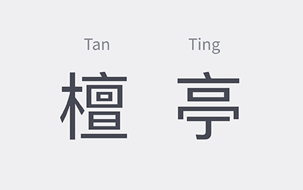
Tan: Sandalwood.
The brilliance of this name is how multi-layered messages are created with just two characters. These brings the two cultures and countries together in a subtle, artistic way, symbolising Australia as the ideal second home for our target audience.This rationale allowed our designers to create beautiful, interpretive logo elements.
There is also a phonetic alignment to the Teddington brand, presenting a solid and proper brand image. Both characters are commonly used in translated names, giving a western look and feel to the brand.
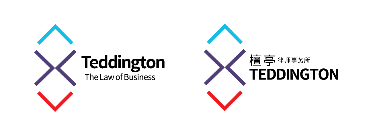
Using elements from the Tan Ting visual identity we evolved elements of the orginal Teddington brand to incorporate the characteristics of the newly imagined Chinese brand identity.

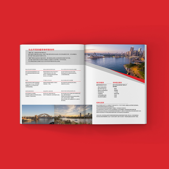
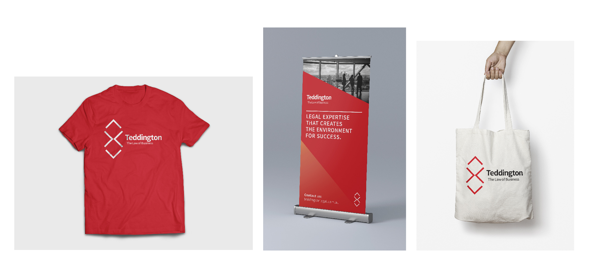
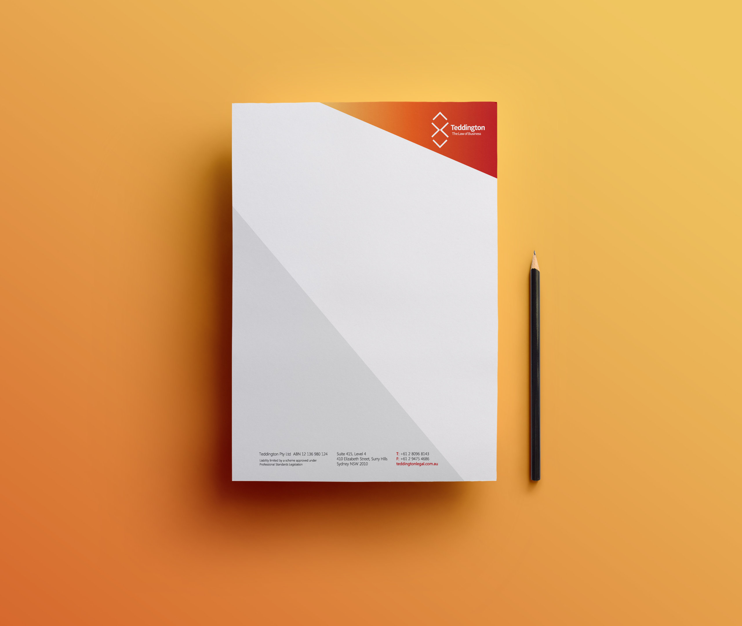
New collateral was developed for both business units.
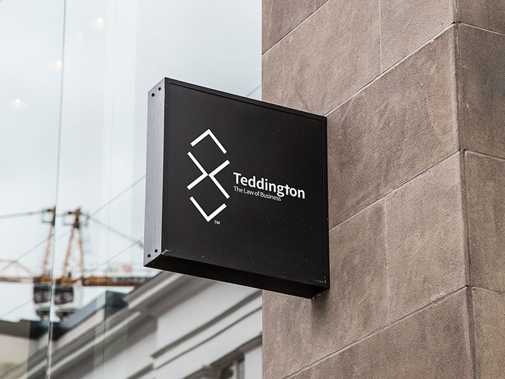
Moving to new offices provided an opportunity to bring the brand to life in the physical environment.